Archive for June 2017
DIT new foundation logo
The new logo design for the DIT Foundation IS so strong it’s is a wonder that DIT don’t adapt is as their main DIT Logo. With its main graphic identity being a period 18 century copula It gives a certain ivy league credence . Such a strong architectural symbol gives reference to a well established…
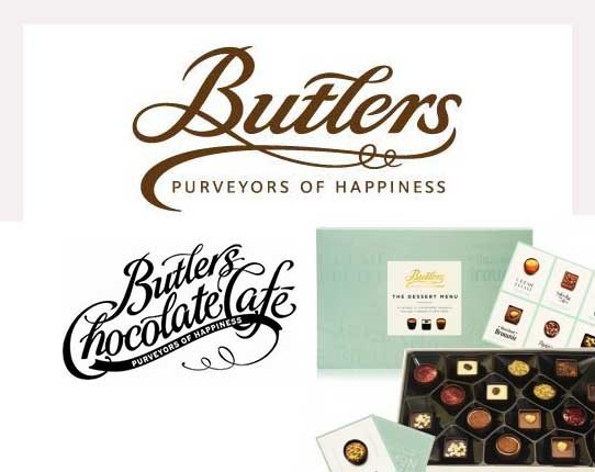
Read MoreButlers purveyors of good typography
Anyone who has had to design a logo which can be used genetically across all types of packaging from contemporary to traditional knows how difficult it is. In the case of Butlers Chocolate this problem has been answered by designing a typographic logo. This approach to logo design was prevalent in the Edwardian Era when…
Read More
