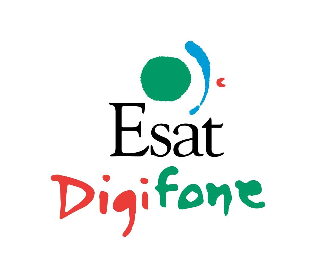
I designed this logo for Esat, (Denis O'Brein's new Company) in 1992 I had been on holidays in Spain the previous week and my head was full of colourful images that are so prevalent throughout Spain. In Spain the work of Miro and Picasso is everywhere. Being highly influenced by their work I was determined to design a original and creative logo that was both European and contemporary and not influenced by celtic graphics. On that Gloomy day of the presentation bright colours of the Esat logo design stood out a mile. It did not look like a phone company or anything like a phone company, but it did look exciting and different and Denis Loved it. It was fresh, new, colourful and creative image which was what Denis was trying to convey about his new service. For the record the Green circle represents the earth, the blue streak ,the signal/echo from a satalite and the red circle represented a satalite itself. Since then I have often been asked to replicate it but I keep telling clients, every logo has to have its own solution!
Tel: 01 4966004 info@paragondesign.ie
Paragon Design, 15 Oxford Lane, Ranelagh, Dublin 6.
Paragon Design, 15 Oxford Lane, Ranelagh, Dublin 6.


