Blog
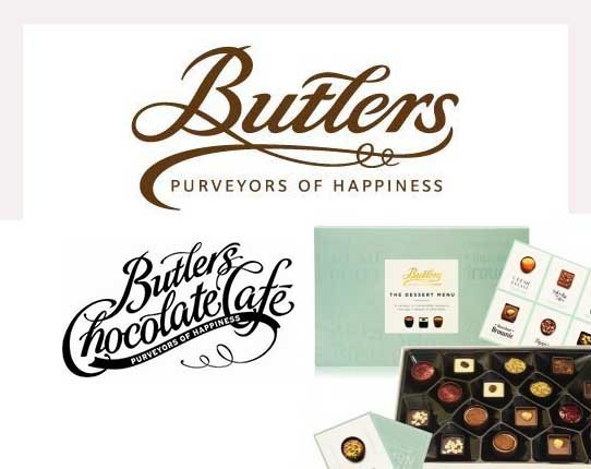
Butlers purveyors of good typography
Anyone who has had to design a logo which can be used genetically across all types of packaging from contemporary to traditional knows how difficult it is. In the case of Butlers Chocolate this problem has been answered by designing a typographic logo. This approach to logo design was prevalent in the Edwardian Era when…
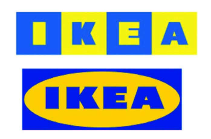
Read MoreIkea logo uprade
Considering how clever Ikea has been with self assembly furniture you would think they would have spent a bit more time on there logo. There can be no excuses here the company throughout its years of growth should have addressed this problem along time ago. Whilst they are successfull i would think that this bad…
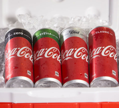
Read MoreWhy Coke revamped its brand identity and packaging
Coke is rolling out its new ‘one brand’ packaging design across all its cans and bottles in Australia this month almost a year to the day after announcing the biggest marketing overhaul in its history.Speaking at an event in Sydney today, Coca-Cola’s James Sommerville, vice president of global design and the architect of the design,…
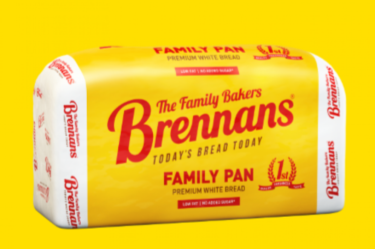
Read MoreWhy the Brennan’s Logo is more than just a logo!
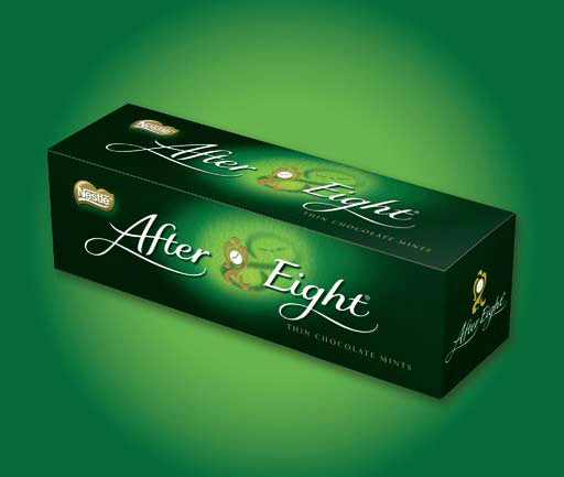
We’ve grown up with it as Today’s bread today. That distinctive yellow packaging has guided many of our sub concious visual memory to grab that product off the shelf with its resasurring logo in red. But like Coca Cola and After eights it is the brand name that is the biggest image on the pack.…
Read MoreAfter Eights Timeless Elegance…
The after eight’s packaging is timeless, in actual fact its 35 years old. The packaging design has barely changed and is easily recognizable. What
Read MoreIf it ain’t broke why fix it, new AIB logo.
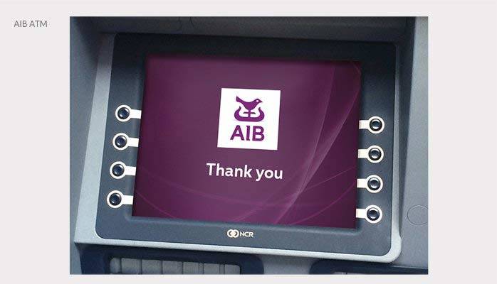
the new logo design is strong and is similar to the old branding identity
Read More
